Three Acrylic Still Lifes: Cup, Chair, Padlock
October 28, 2026
I wanted to work some more on acrylic painting, by masking off a sketchbook page and painting some still-life type images from reference. To each of these images I applied the same workflow: reference image into the Notan Generator, then Shape Simplifier. I stepped away from the colour swatch extraction for these pieces to test my mixing straight from the reference, using some on-the-fly mix correction and value intuition.
The cup
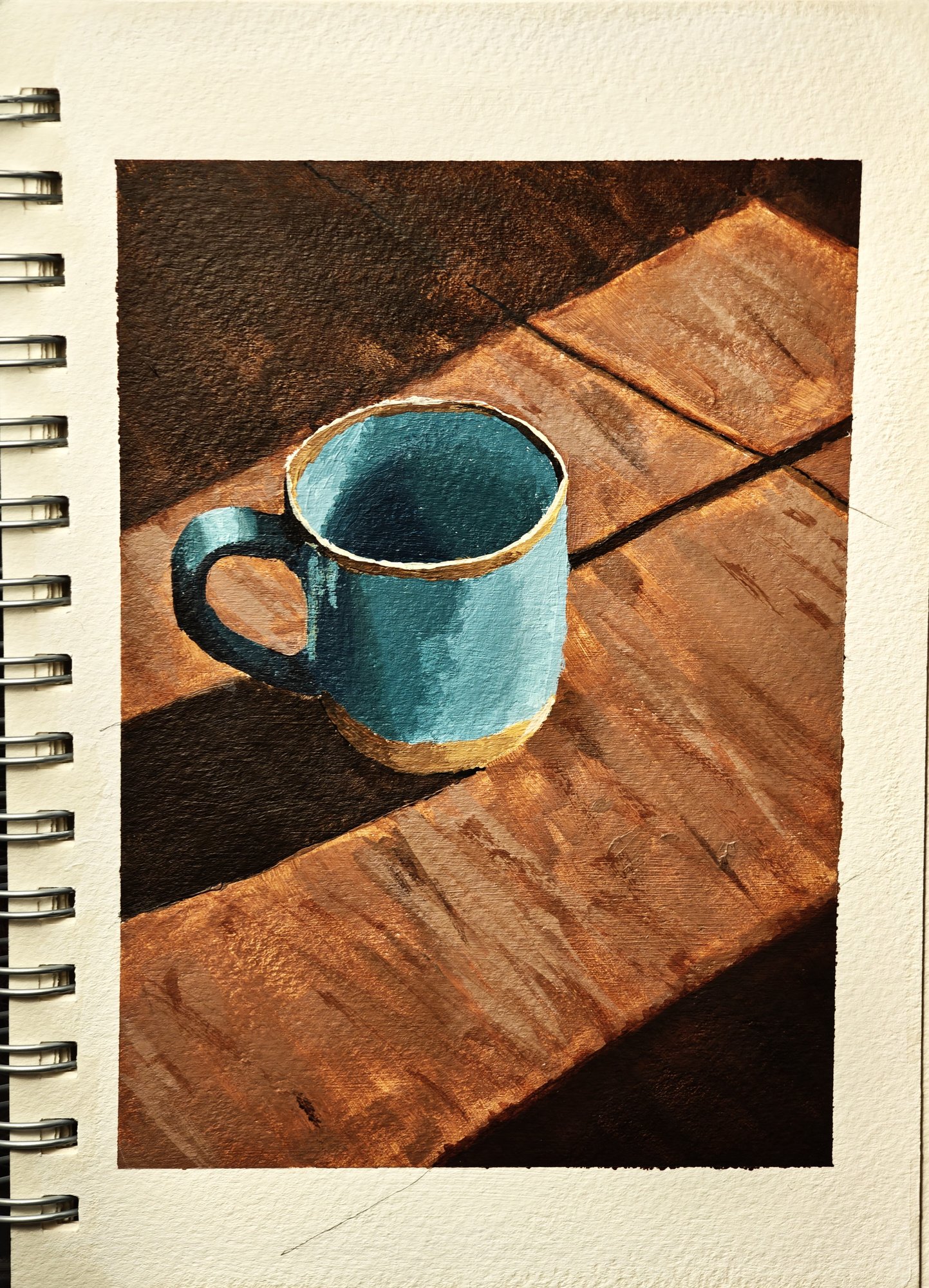
The first piece I chose to paint to challenge my drawing skills, as I always struggle with cup handles for some reason. Even this piece wasn't the best, but the benefit of painting is that you can make sculptural corrections with the light in the painting after the drawing is laid on the paper. The second main focus of the initial piece was to push the notan and really pull a striking contrast between the light and shadow in the image, pushing the darks a little further than I felt comfortable with. Having the Notan Generator and the Composition Analyzer, I was able to find a composition that stood out to me, which I used for the layout on paper. I think this image worked well because I was able to play with the colour contrast as well: as the image is mainly blues and oranges, a complementary scheme really helped to frame the subject of the cup. I didn't intentionally notice this from the reference I used, but on reflection of the piece it becomes obvious. Looks like I need to sharpen my analysis skills a little. Cylindrical surfaces are a great practice subject for the soft turning edges, to play with value transitions, something I'd like to practise more and study further in masters of this type of transition like John Singer Sargent.
The table and chair
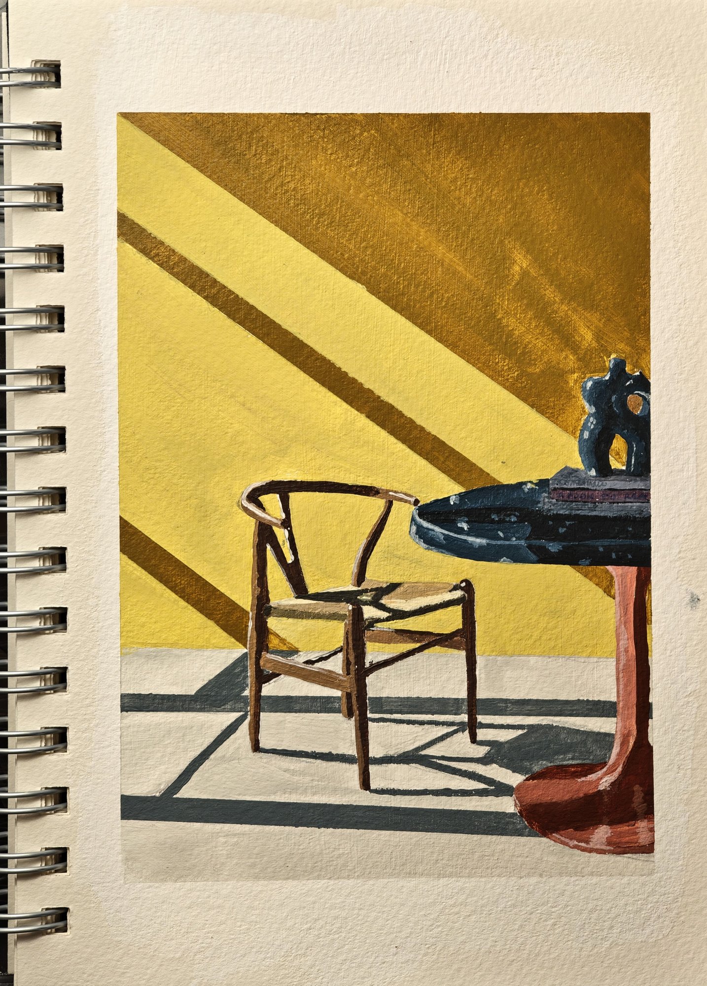
I tried to stay in the theme of strong light and shadow for the next one, of a table and chair. Reflecting on this piece, it carries a somewhat triadic colour palette with the yellows, blues and muted reds. I selected this image to work on as there was a copper material for the stand of the table, and I wanted to practise how to capture the essence of that metallic material on paper. It didn't quite hit the punchline in my sketchbook piece, but I feel that I could achieve a better result in the reflected highlights of this material, to really push its reflectivity and metalness. The table top was also clearly marble from the photo, with a chipped, textured effect that I struggled to lay down with strong representation, but overall I was generally happy with the weight of the values in keeping the piece cohesive in terms of lighting. Around the vase thing in the centre of the table I can see the edges where I've gone back around with a brush, maybe to sharpen the edges. I'd probably consider this a bit too perfectionist for a sketchbook study, and I'll have to keep this in mind for the next things I work on. I think, outside of the chair back being slightly askew, I was otherwise happy with the outcome of that as the subject of the piece. I almost look at it and think, I wouldn't mind taking a break on that chair, basking a little in the sunlight.
The padlock
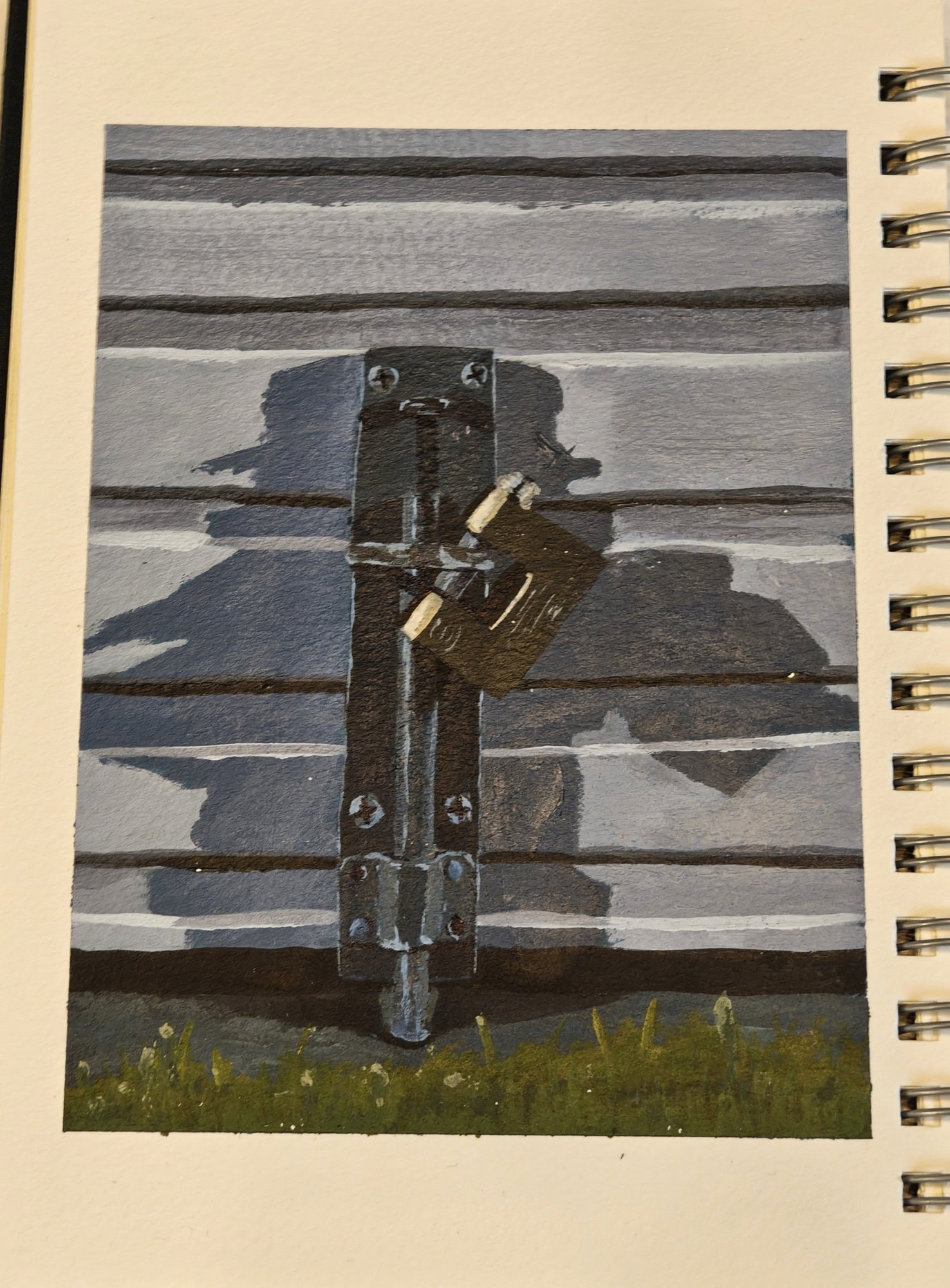
My third piece was actually painted from a photograph I took while out with the dog in my neighbourhood. A simple garage lock for some reason appealed to me at the time, as it had these interesting shadows cast from multiple light sources, which I thought would be a good opportunity to see how that felt while painting. It's two street lights, as the photo was taken at night, and I really tried to blue everything out to capture that time of day. I really like the way the locking mechanism has been represented with unstraight lines (this time I just accepted the wobbles), giving contrast to the mechanical nature of the subject. I struggled with the brass padlock by bogging down in too much detail. So a valuable lesson from this was the step-back approach: paint over, think of shapes and value, and then worry about the colour at the end. It wound up representing the padlock as I'd hoped, and overall I was quite happy with the result of this image.
The Notan and Shape Simplifier tools were invaluable for these studies, as I am not as familiar with these subjects as I have been getting with portraits, allowing me to gain some more confidence in the use and creation of these tools to assist the process.
Materials used
- Winsor & Newton acrylic paints
- Canson Art Book A5, 300gsm
- Jakar water tub