Reading Value Beyond Portraits: Five Studies in Alcohol Marker
August 31, 2026
Following on from Six Heads, Three Sheets: Pushing Past My Comfort Zone in Coloured Pencil, this one steps somewhat outside portrait practice, with five small studies in Ohuhu alcohol marker: a house, a stylised rock arrangement, two landscape attempts and one portrait. All of them went through Value Study first so I had an honest read of the values before any colour went down. I used it as a chance to see how the studio tools hold up across different subjects and a different medium, partly to see whether they could help with choosing markers, but mainly to keep chasing the theme that's run through the last few posts, which is to keep the values separate first and then see what's possible from there.
The house
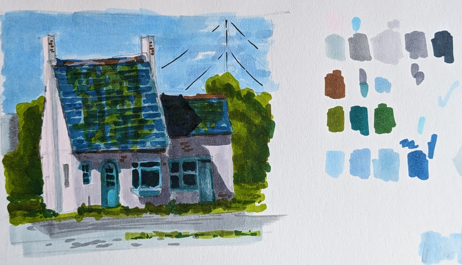
This is one of the two studies I'm most pleased with here. What I like about it is the light. I was paying close attention to value separation while working through it, using Value Study to check the swatches against the piece instead of judging by eye, and I think that attention shows in the result. Shape Simplifier came in handy too, as my reference was a photograph and I wanted to strip the detail out and work with larger areas of value.
Given the house was white, it was an easy decision to start with one of the lightest alcohol markers as a wash. From there I worked up through the lower values gradually, and came back around to the lightest areas last. That meant looking at the shapes again and again, and asking how extra values within each bucket could push the contrast of the image. Because the shadows in the reference were all cast shadows, I could relax a bit about the terminator edges, since I knew they'd mainly read as hard edged, and that let strong shapes sit clearly between the light and dark areas, which is where the result above came from. It's always a case of getting a piece to a certain point and then reworking it until you're happy. I try to remember that the decision on contrast and how strong to shade is always mine to make, and the reference is just that, a reference, which leaves a lot more room to play.
The rock
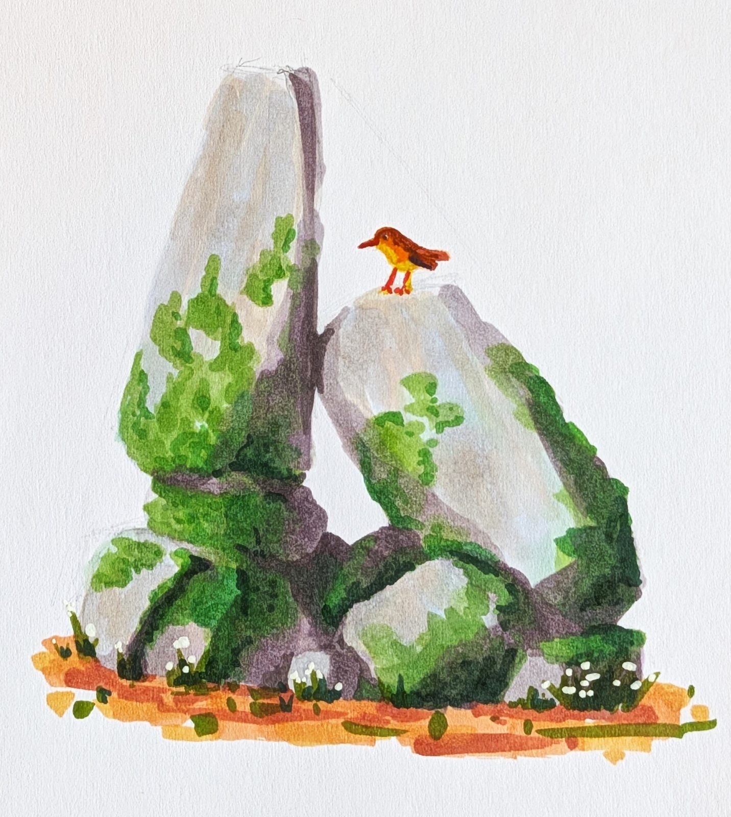
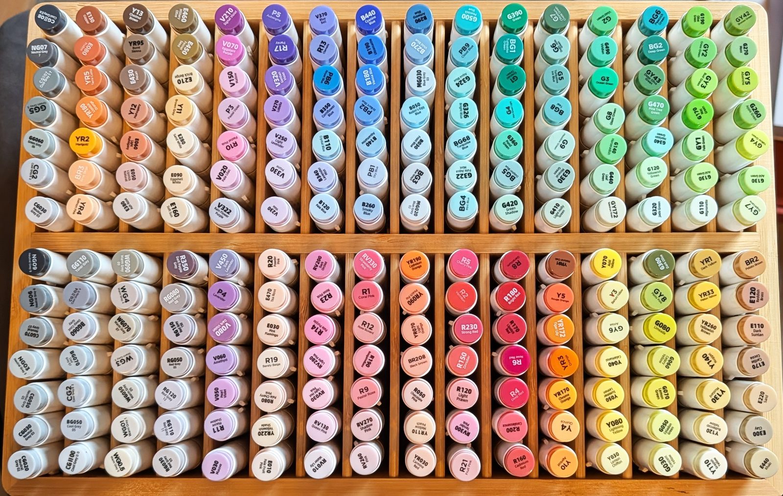
This one was more about the materials than the subject. I'd just reorganised my alcohol marker set (pictured above) and wanted to see whether having it properly arranged by value and hue would let me reach for colour on instinct instead of planning a piece out completely in advance.
I was surprised to find that colour choice mattered less to the result than I'd have given it credit for beforehand. The strength of the image was in the values, to the point where I felt I could reach for almost any colour and the piece would still hold together, although I was still working from a reference and wanted the local colours to stay close to it. I thought a small bird would be a nice addition, but it didn't come out the way I'd pictured it, which was a good reminder to keep using the reference where I can instead of improvising past it. The useful thing to come out of it was seeing that value was doing nearly all the work while colour was getting the credit.
Two landscape attempts
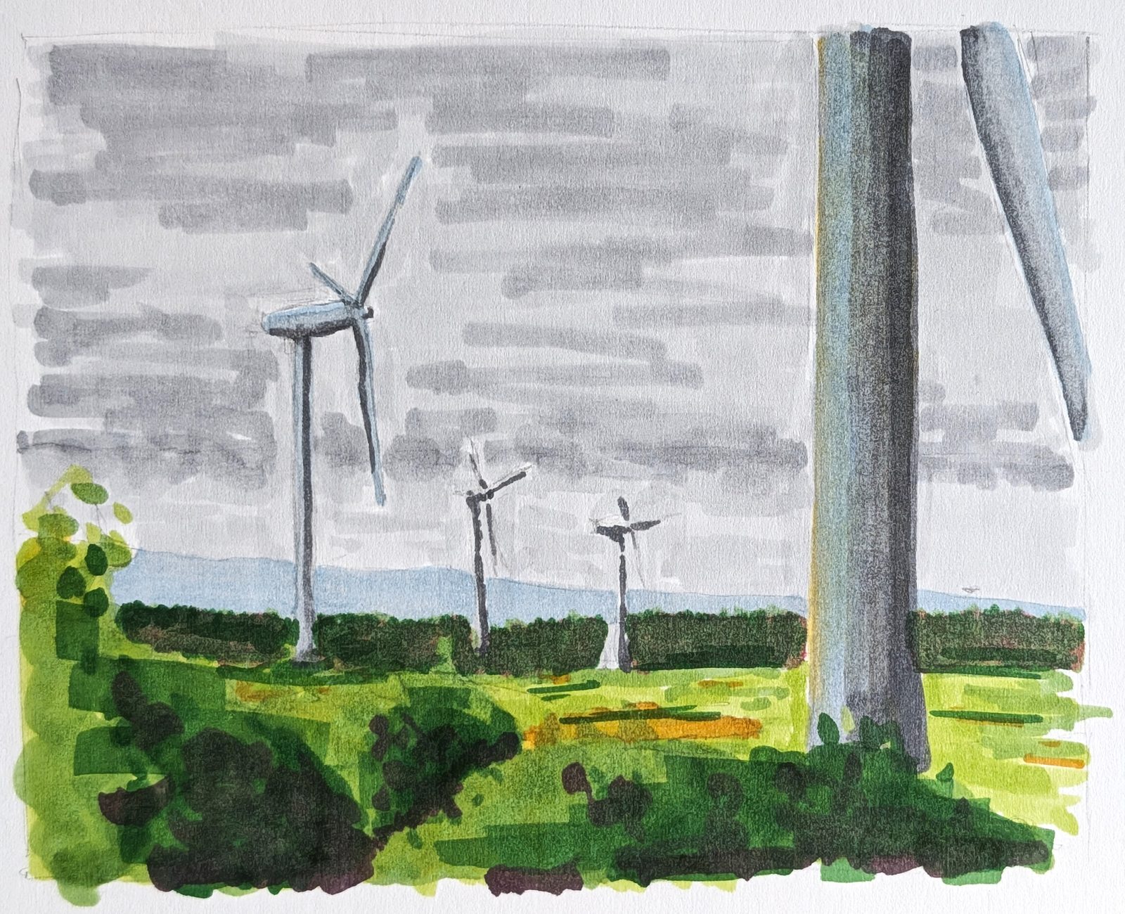
The windmills were the first piece I attempted here, done on site, partly to see how alcohol markers held up for getting a scene down quickly and partly to try a viewfinder (the same idea behind the framing tools in Composition Analyzer) to find the composition before committing anything to paper. It's a good habit, as simplifying what's in front of you before you start drawing saves a lot of second guessing. The markers were fast, and the whole thing took about as long as a coffee break while I waited on a friend before a walk around the wind farm. After using the viewfinder once or twice to lay in the first marks my eye had adjusted to the area I'd framed, and I could keep working from the reference without lifting the finder back up every thirty seconds. All it needed was that first framing on the page, and getting the largest shapes in first was enough to guide everything that followed.
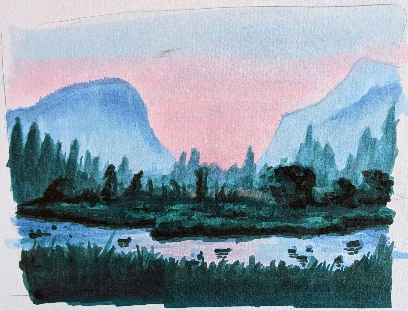
This second landscape I wasn't happy with overall, but there was one thing I liked, which was the value of the sky reading through in its reflection in the water. I wouldn't call it a success, though it was enough to show me there's still something worth chasing in this kind of exercise. I leaned on Shape Simplifier heavily for this one, trying to keep the background, midground and foreground as clearly separate as possible on the page. I think the problem was that I went for more detail than the markers can deliver, since the tips just aren't fine enough for it, and I'd probably have been happier sticking to bold, thick chisel strokes for the whole piece. Either way, I used it as a chance to practise blending with the alcohol markers and wasn't disappointed with how that side of it turned out.
The portrait
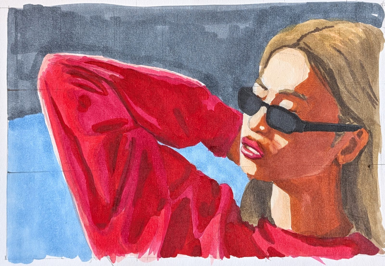
The other piece I'm most pleased with. I left the construction grid visible here on purpose, so you can see how the proportional grid from Composition Analyzer translated onto the page. My intention going in was to test out Temperature Map and restrict my colour choices to those families, ignoring the reference's local colour. I forgot to follow through on that, though. I ran into proportion issues with the initial lay-in and ended up using the colour picker in Paint Mixing to pick pens for each area instead. The proportion issue was my own doing: I drew a grid in the sketchbook without measuring it against the ratio of the digital grid first, so my first pass came out badly out of proportion and the woman's arm ended up looking roughly twice as long as it should. I erased it, measured properly and got the grid right on the second attempt.
Like the house, I chose colours by value bucket, matching pens to the reference's local colours and reusing the same pen anywhere I saw the same local colour, which in practice mostly meant the jumper and the lips. In some other paintings I've worked on but haven't shared yet I've noticed I tend to get better results from a limited palette, and I think this is a version of the same thing, in that reusing colours across a piece gives it more harmony than treating each area on its own.
Speed versus control
I found alcohol marker a noticeably faster medium to render in than coloured pencil. Depending on what you're after, that could be the trade off you want, and if speed matters more than control for the work you're doing it's worth trying. How fast it is comes down to how you use it, though. Artists like Luan Tie, working as Dirty Iron, take their time with markers and reach a level of realism that stops me in my tracks.
For me, though, coloured pencil still wins. The control and the layering are worth the extra time, and a smaller set of pencils stretches much further than an equivalent set of alcohol markers, because you build the colour up gradually instead of being stuck with whatever's in the barrel.
Where this goes next
This exercise is part of what confirmed that preference for coloured pencil over alcohol marker going forward. It's also where the next stretch of posts is headed: the Features track, starting with eyes, then nose, mouth and ears.
Materials used
- Ohuhu alcohol markers
- Hand-bound (by me) sketchbook, Ohuhu alcohol marker paper