Two Master Studies on the Zorn Palette
September 29, 2026
I want to squeeze in a couple of master studies I completed of portraits. I feel I made a little bit of a breakthrough with these, so I hope to include them. The study references I used were Lord Pendleton concept art by Cedric Peyravernay and Ahmed Aldoori's Face Practice. Both studies used the Zorn palette, Flame Red, Yellow Ochre, Ivory Black and white, with a touch of Ultramarine for seasoning, and were done in a Stillman & Birn Zeta sketchbook.
I think the big thing about this post is that I didn't use any of my tools or simplify the image in any way. Because the studies were of pieces that were art already, it felt somewhat easier to draft and paint, due to the inherent looseness already part of the original artists' work. Although I used these pieces as a guide for hue and value choices, I really felt that the way I was laying down the brush was my own, and this was an incredible feeling, especially being happy with the results to a degree where I feel I made progress. Interestingly the lighting situation in the Dishonored reference was not the easiest, but perseverance helped me push through.
Study one: Lord Pendleton
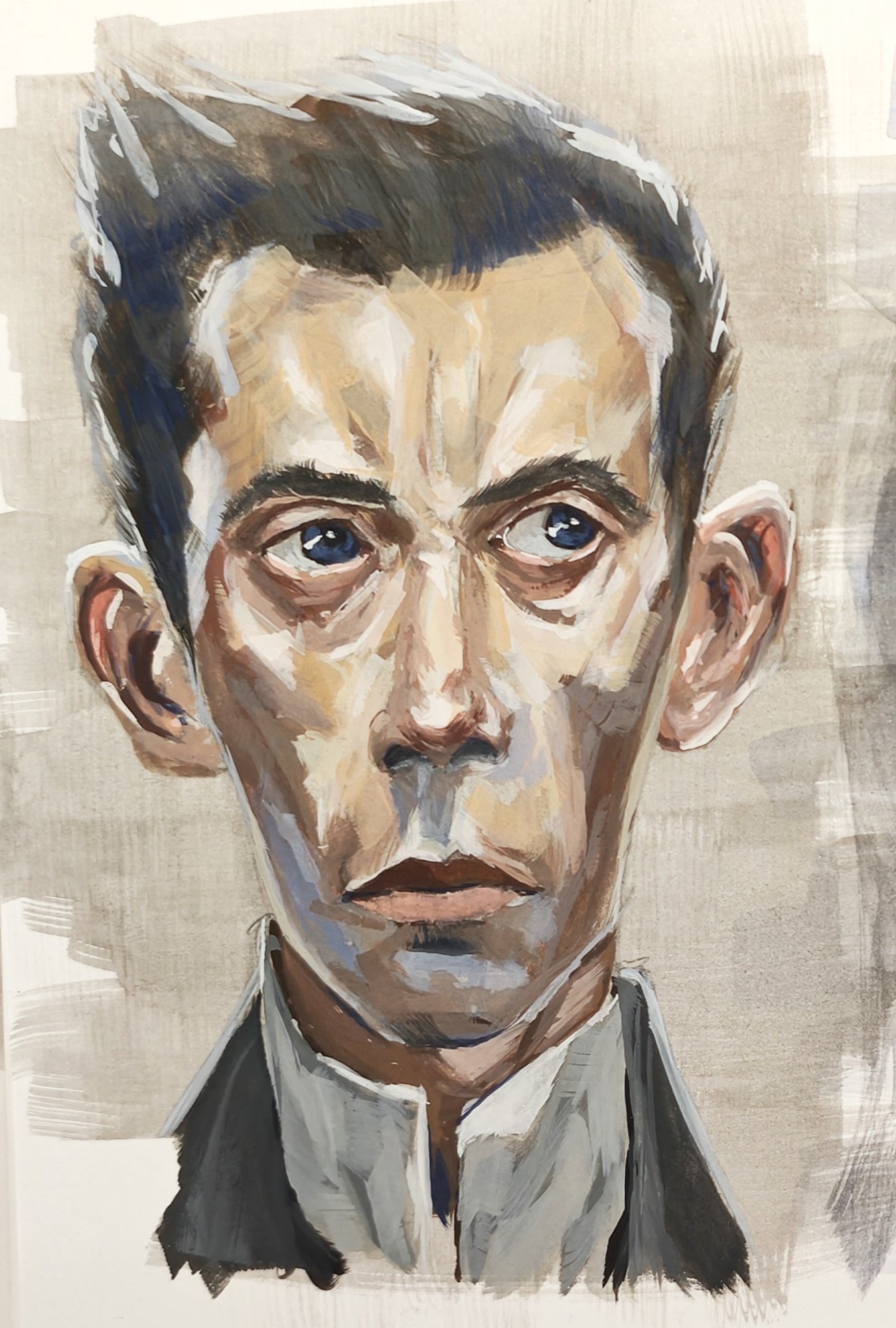
Now, a couple of thoughts. Working through the Dishonored reference I really pulled the saturation and colour out of the mixes, causing an overall darker and desaturated result. Something that could work for more dingy lighting scenarios perhaps, or to show a character's wellbeing to an extent. It really enlightened me to the potential for storytelling through colour. I introduced some Ultramarine in this image to pull some blues forward in the piece, and although not totally functional in terms of value, the subtle pop of colour really spoke to me, which has given me some ideas to try in other paintings.
Study two: Face Practice
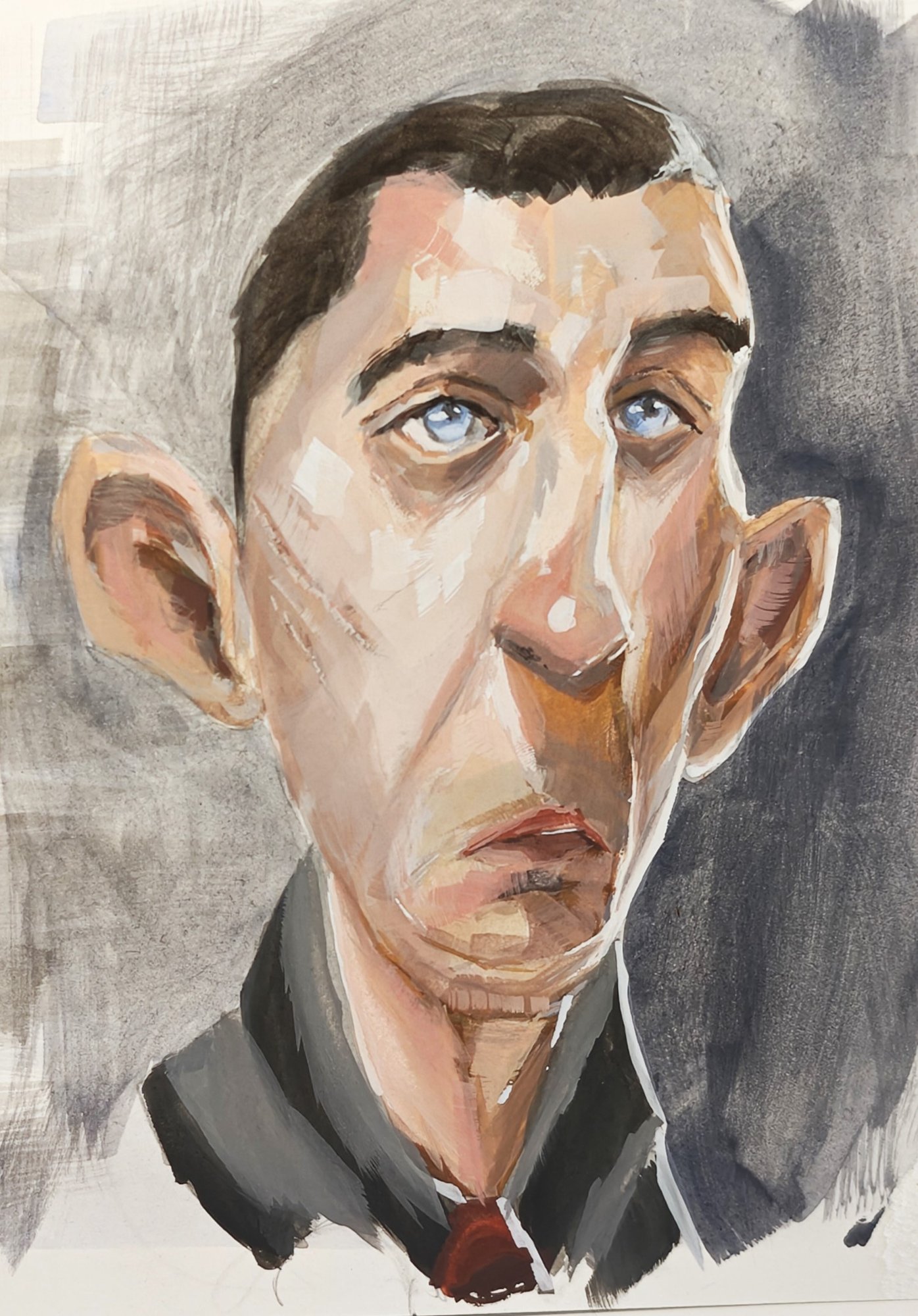
For the second study, of Ahmed Aldoori, I reflected on the result of the first in terms of the desaturation and made it intentional to pull more pigment into the mixes. I used the exact same palette and mixes as the first study, but just pulled more pigment into them. I feel that in these situations, especially when laying down the first colours, I am always overpowered by the colour, causing me to step it back, but this time I just went for it and I loved the results. Using the reference only for the warm and cool regions in the piece, plus value, I tried to be as saturated as I felt I could push it without entering unnatural lighting territory. The difference between the two can be seen very clearly, and I have to admit that I enjoy them both, as they convey different things. Could it be that the first study is of a person who is less well off and shows less colour in their face (which is funny, since the reference is of a lord!), and the second shows a degree more health from having more colour in the cheeks? Some interesting things to think about with these, but I was very pleased with the result.
Working larger, and the palette
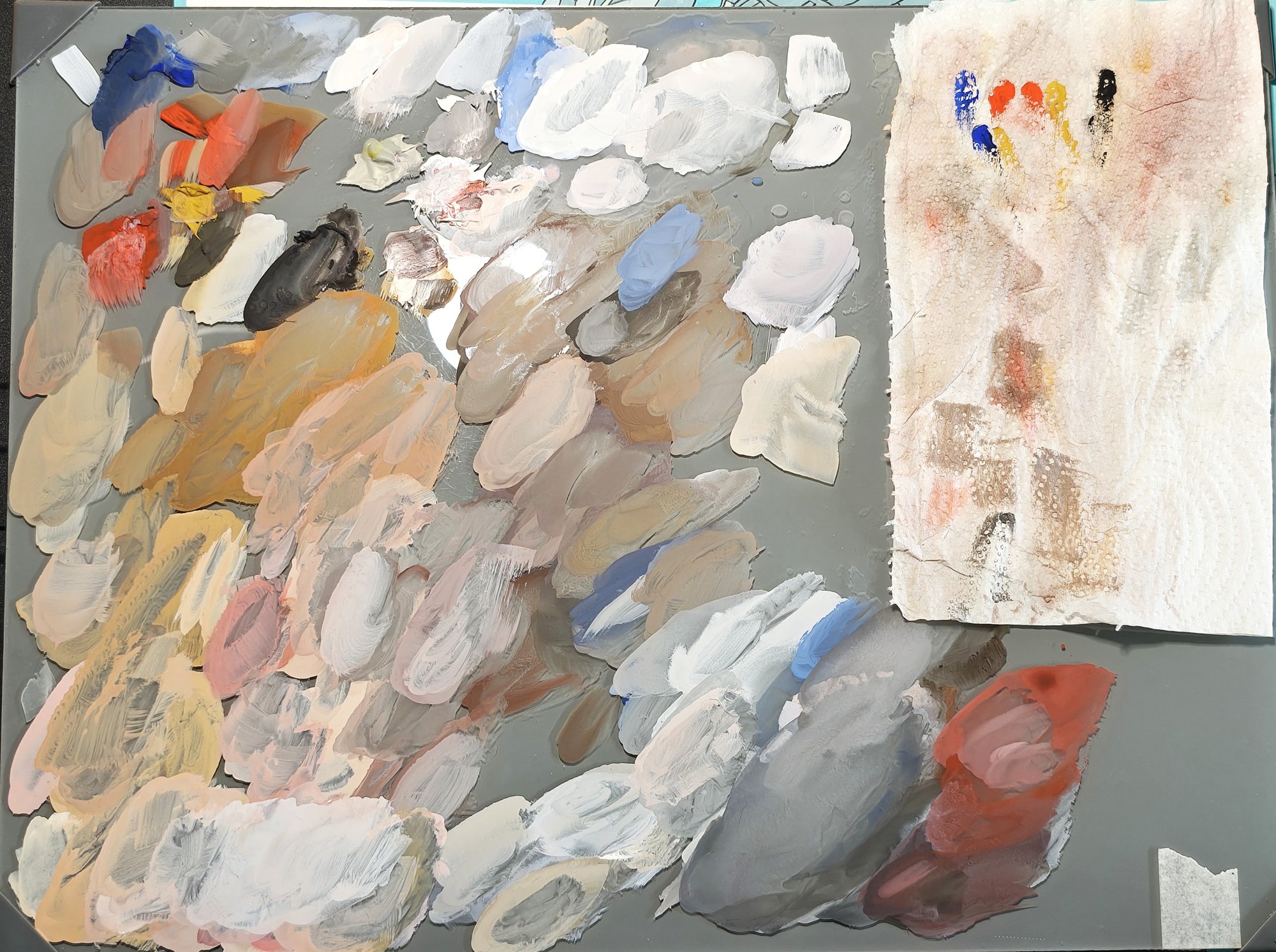
Subtle differences in method I think are worth mentioning during these studies. I worked larger, around four times the size of the smaller studies, and increased my range of brush sizes from large to smaller. I feel this allowed me to capture more subtle changes in the palette and be bold with the larger shapes. What this introduced, however, was a tactical change in the way I used my palette and mixed my colours. Here's an image of the aftermath. Against what I was trying for in the last posts, to create and stick to value strings, you can see the principle of this during my session, but something beautiful happened in that I was just dancing about the palette as I got into the swing of things. Does it need more red, is it darker, could this be pulled purple, were the questions I was asking, and the result was me pulling mixes from elsewhere and mixing them in other places, then layering them to see the result. Gouache is forgiving, and if something was off to a degree, it's just a remix and a layer, problem solved.
Extremely useful study for me, and as always I worry that I'll not be able to achieve these results again, especially with the palette navigation, though writing the blog hopefully reinforces these thought processes and I can better reflect and adapt as I move onto the next. I'll be looking at some hand studies and expressions.
Materials used
- Holbein Artists' Gouache: Flame Red, Yellow Ochre, Ivory Black, white, Ultramarine
- Stillman & Birn Zeta sketchbook