Four Plotter Pieces: Posters, Book Covers and a Change of Mind
October 21, 2026
I wanted to take a break from the usual for this post and put my pen plotter to some use. I really like the work of Joel Cammarata, who I initially discovered on Reddit, and I think about some of the ways they use pen layering to create interesting effects, which I now know to be moiré. I was also inspired by the works of Julian Montague and his faux book cover designs and impactful compositions.
I worked on a total of four pieces throughout the break from portraits, and was happy with the new thought processes and ways of thinking that were occurring by looking into other forms of artwork. I felt that with pieces of this nature, compositional observations were crucial to the way pieces desirable to my eyes were perceived, and I wanted to explore ways in which these types of design compositions were and could be used. Coupled with these experiments, I wanted to use the opportunity to try and create line vectors plotted with the pen plotter that not only created moiré effects but could also be blended. Unfortunately I'm still working on that, and my attempts didn't quite cut it this time around, but all experience is valuable experience when doing these things.
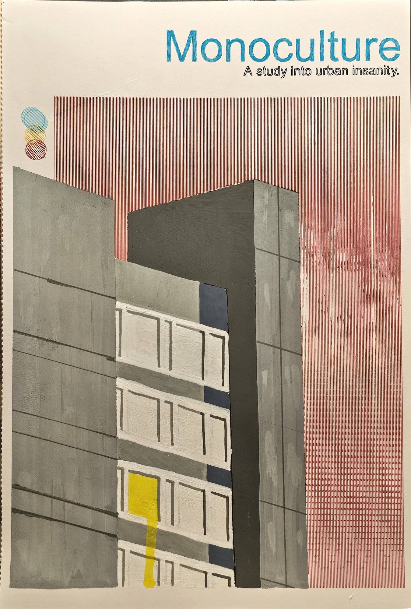
Monoculture
For these pieces I used a mixed-media approach and moved more towards faux poster and book design. I think the most interesting outcome from these exercises was my thought process between the first and the last piece. To begin the mini-series I worked through some photographs on Unsplash for inspiration, and I am always captivated by brutalist design. I wanted to try and capture that concept in a dystopian type of world, like an academic study book cover with a retro design. Outside of small thoughts on the subject, I just tried to shift the image around until I was somewhat happy with the composition and text, eager to get something created with the plotter.
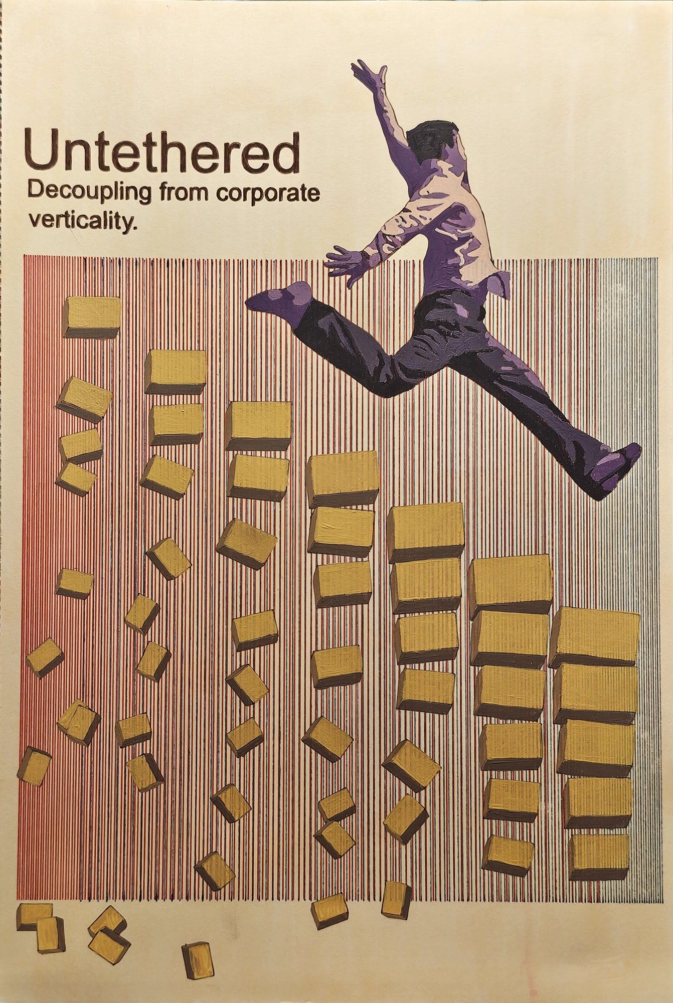
Untethered
For the second piece I was more warmed up to the software and implemented a bit of a workflow. I sat and drafted out a couple of textual ideas about how I was feeling, and I'd had a particularly bad day at work, which drove me to come up with a design that conflicted with the "climbing the ladder" narrative you associate with corporations: trying to create a visual narrative where the right direction to be moving on the corporate ladder is actually down, the way to personal freedom, as the higher you go the more unstable things below you become. I had the chance to use some p5.js programming for this, to facilitate the creation of vector shapes that could be exported and pulled into the pen plotting software to build the composition. I made my first blend attempt with this piece, and although it didn't work as smoothly as I'd hoped, I can certainly see elements of it beginning to work. As I mentioned, it's good to have different types of problems to solve in the toolbox, and at the end of the day you might reflect on this and go "it'd really be easier achieving what I want with watercolour" or something, which would be good for mixed media. I also wanted to move away from the white of the paper for this piece, to give the sheet a more vintage, older print look, so I layered with alcohol markers in a light yellow to try and create this effect.
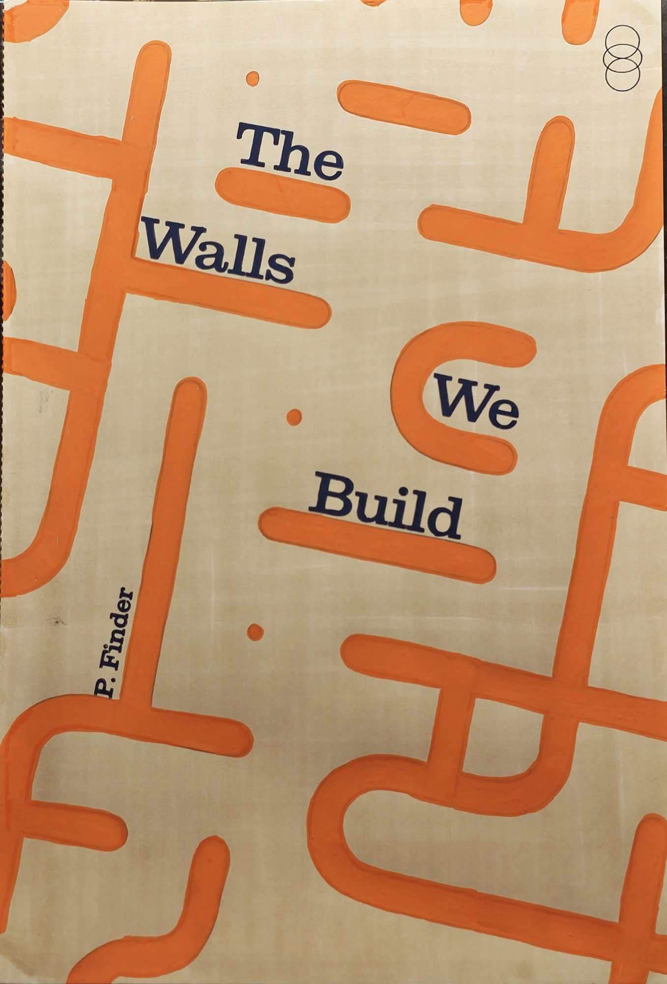
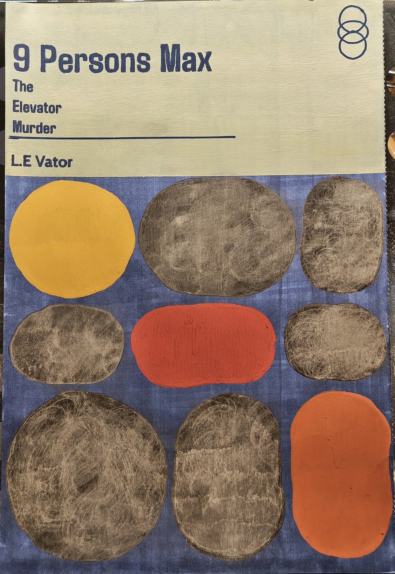
The Walls We Build and 9 Persons Max
By the third and fourth pieces I went all out on the book cover designs and used some of the teachings from the first pieces to build the last. As I mentioned, the most important observation and outcome from this for me was the workflow of creation: thinking and concepting some ideas at the beginning of the work, then refining and following through during the design of the piece. For example, in the piece "The Walls We Build" I had an initial idea to build a vector maze with an internal story of finding your way through a challenge or something, very rough ideas. As I worked through some p5.js maze creation code and snippets, I inadvertently had another idea pop into my head as I was working through designs: that our lives are like a grid of dots, unconnected when we are young and free, when movement is flexible and in any direction. As we grow older, the paths we follow leave behind walls, and at one point or another, when we return to those places, we reach obstacles built by our own choices. And all this from messing about with a design idea. So I was particularly happy with this one, as it became more meaningful to me not only from a design perspective but also from a self-reflection and story perspective.
I've mentioned it multiple times in the post, but certainly, outside of the technical achievements and progress of these works, the most valuable thing was a mindset change in terms of the artwork, one that I can hopefully begin to apply to my other pieces. I would also seriously argue, on reflection, that none of the work done in this post necessarily required a pen plotter. That just made the line work very computational and strict, helping the visual and the timeliness of finishing the work.
Materials used
- Molotow paint pens
- Ohuhu alcohol markers
- Ohuhu alcohol marker paper
- Zebra Sarasa Vintage 0.5 gel pens
- Pen plotter