Two Colours and White: Four Gouache Portraits on a Limited Palette
September 13, 2026
The ear post ended with a rule I'd already broken once: choose the palette before the first stroke and don't add to it. So I wanted to test that rule properly, four times over. Each portrait uses two colours and white, which I named before I started, on a reference I'd first turned to black and white so that the only decision left was how the two colours would stand in for the values. Three of the four held to the rule, and the one that didn't is in here as well, as I think it's worth showing.
The setup
All four are freehand pencil sketches from Pinterest references. I kept the drawing stage loose and just looked for something strong in each face. Then I took the reference to greyscale and ran it through the tools, Notan Generator for the two small studies and Shape Simplifier for the two larger ones, where I wanted a firmer read of the shapes to work from. With the colour gone from the reference, the planning became a question of value, which of the two colours, and which mix of them, would carry each value step. After that I followed the same process each time. I mixed a string of values on the palette, used one flat brush for as long as I could and only went to a round for the last details, working dark to light.
Stripping the palette this far helped with more than colour. With only two tubes there's nothing to hunt for, so all my attention went on the values and the mixing, and on the brush stroke itself, and the notan thinking from post one got pushed further than it would have with a full palette within reach.
One and two: the small studies
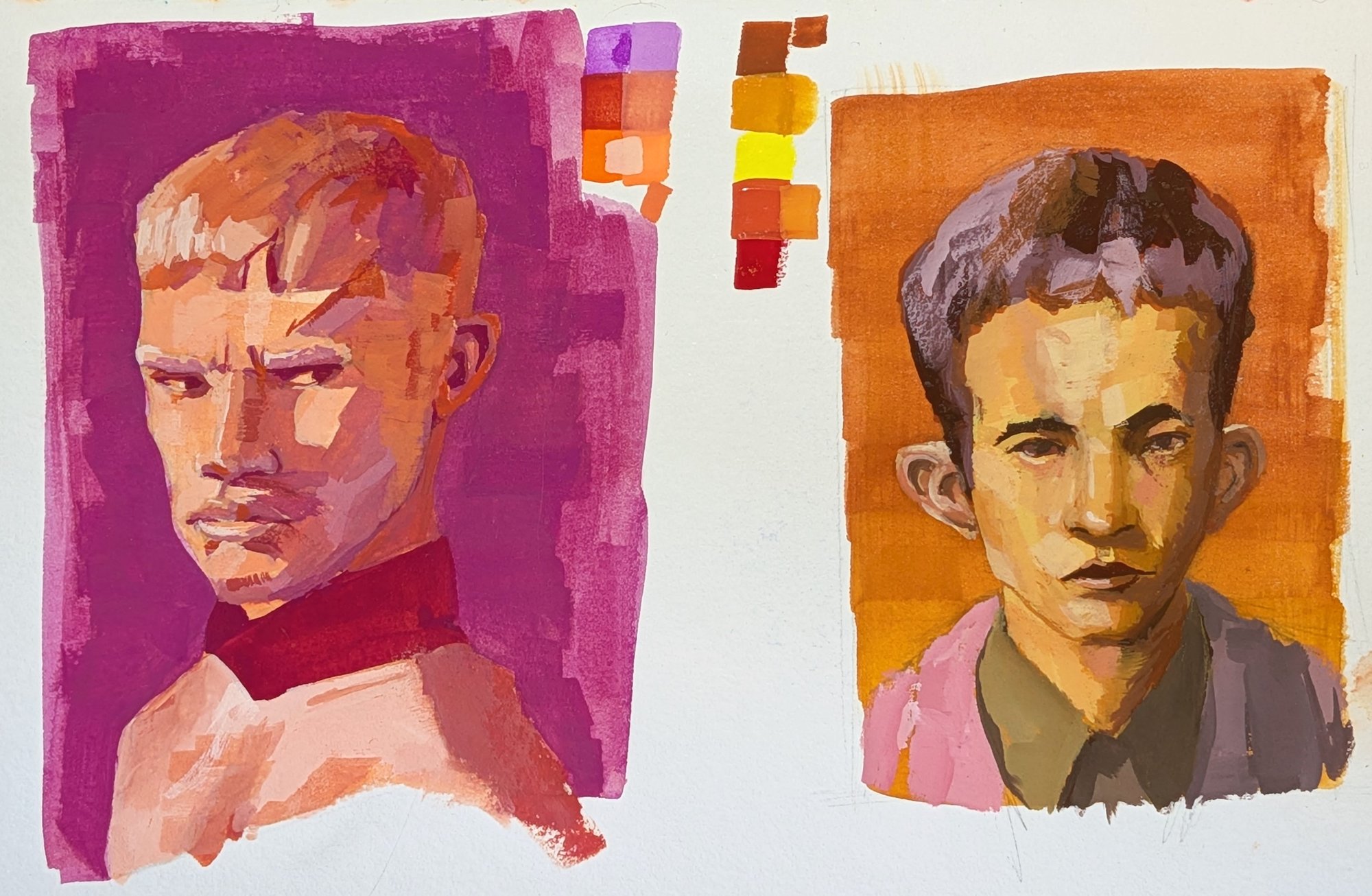
The first is Magenta and Brilliant Orange, straight onto white paper. What pleased me about it is the shadow side of the face. Most of the face is in shadow, and the shadow still has its own steps of value in it, so the form keeps turning and doesn't sit flat. I have a habit of flattening a shadow that size, and the third study below shows exactly that happening. A flat shadow can work well in the right illustration, but I'd rather it was something I decided on than something I fell into.
The second is Lemon Yellow and Carmine, and this is the one that broke the rule. I'd tried to pick tubes with enough value range between them, but this pair wouldn't go dark enough, and I ran out of ways to separate the clothing from the face, so Burnt Sienna came in to push the darks. It was one tube for one job, but the rule was two colours and I used three. The other change on this one was a graduated wash over the whole sketch before painting, partly for the background and partly to solve a problem I'd had on the first study, where specks of white paper showed through wherever a stroke hadn't quite covered. They read as a distracting flicker and had to be gone over again, which disturbed the brushwork around them if the mix didn't match exactly. With a wash underneath, anything that shows through is the one background colour and it sits fine. It's the same reason painters put a warm wash under an acrylic. This face had the opposite problem to the first, as it was mostly in light, and it took a lot of adjusting at the top of the value range to get enough variation into the lit side. It got there in the end though, and it reads as form.
Three: Prussian Blue and Flame Red
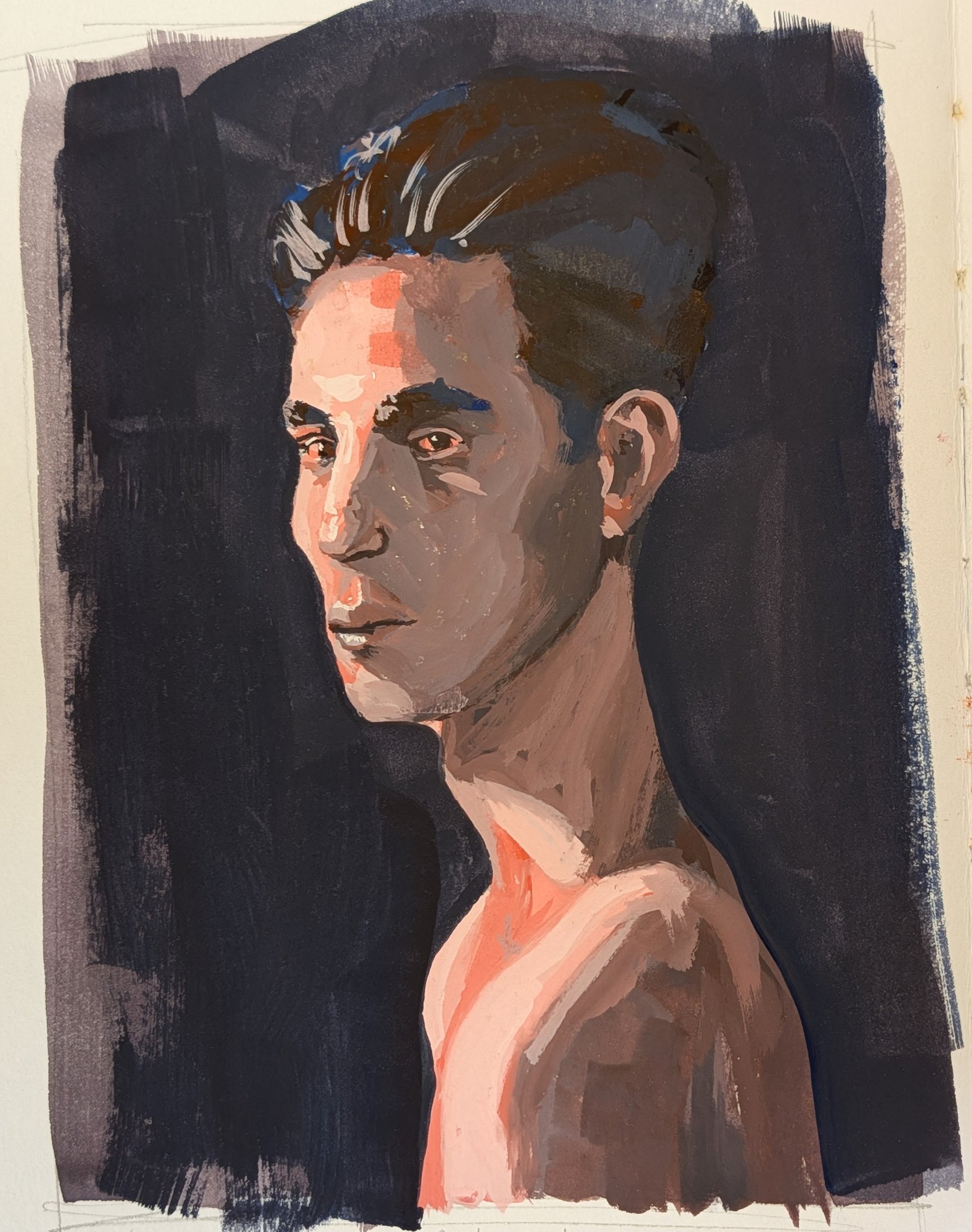
This is the first of the two larger studies, and the one that gave me grief for the reason I described above. The shadow side of the face went flat, and I only saw it near the end. Fixing it meant remixing the darks and working back over areas close to the lights, which left the tonal read uneven in places. I stayed with it though, and I'm fairly happy with it for a study at this size. Working larger changes the job in itself, as there's more paint on the palette and more room for subtle variation in colour and detail than the small ones allow. The plan had been to blend the figure into the background, but that didn't work as I'd imagined, so I darkened the whole background instead to bring the head forward.
Four: Emerald Green and Violet
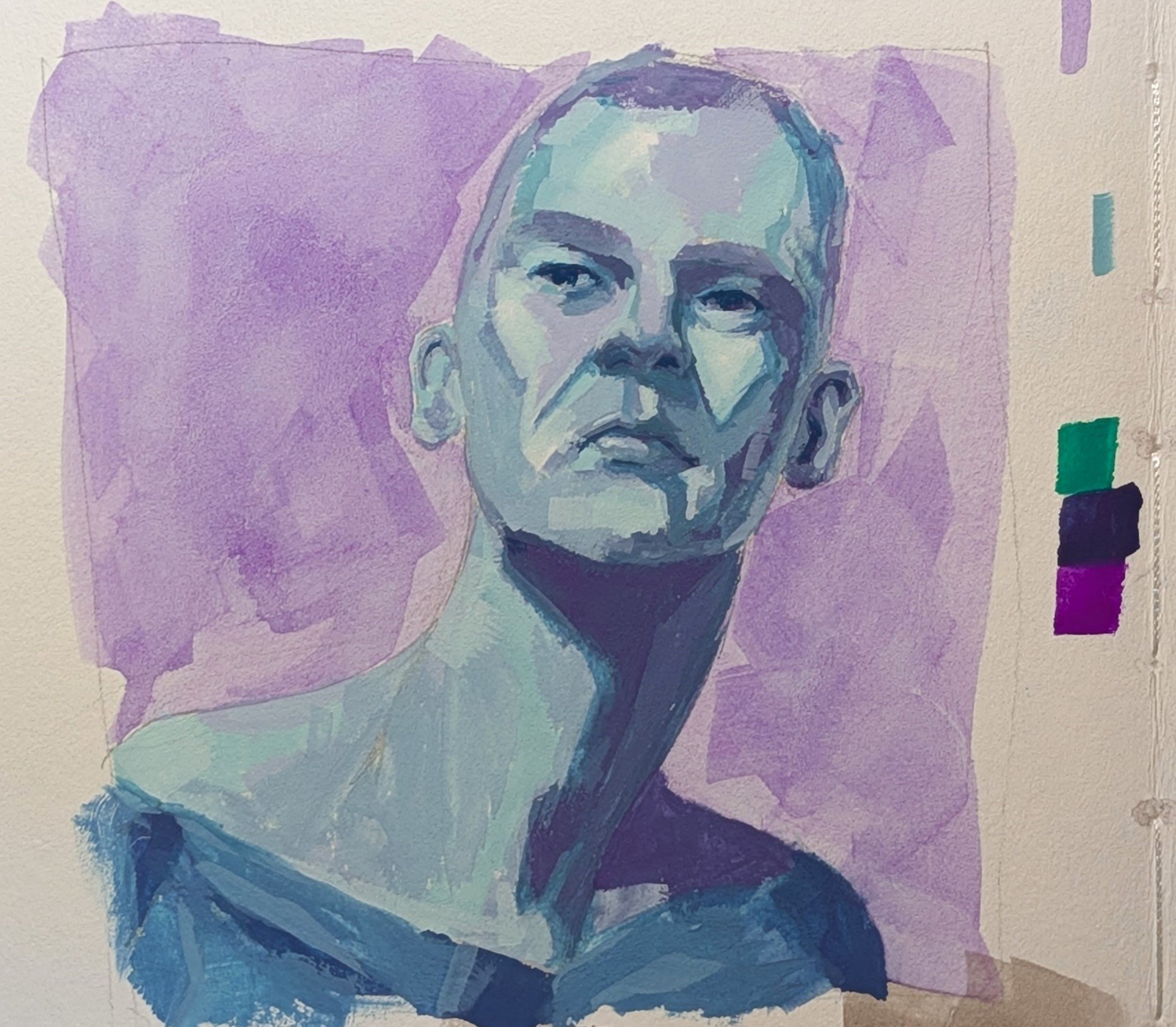
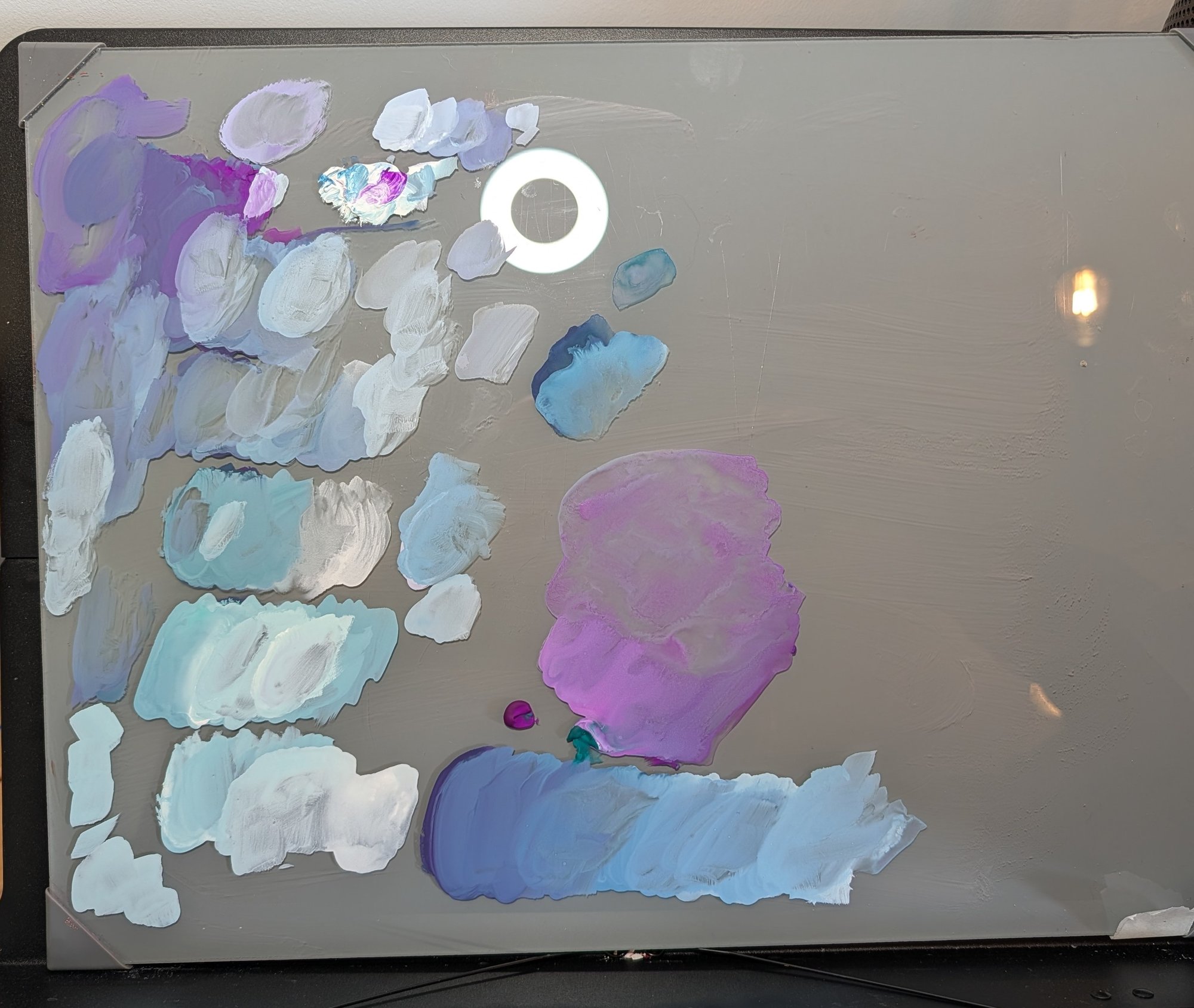
The last one is the study I'm most pleased with, and the one where the practice felt like it was paying off. I had more confidence in the strokes and was more willing to vary a colour on the palette just to see what happened, without worrying so much about losing a mix. I tried a different palette layout, laying out the value string first and then adding white to each step in a row, so the palette became a small grid I could drop in and out of, and traces of it are still visible in the photo below. Otherwise it was the same approach as the first study, dark to light straight onto white paper, with the background washed in at the end. What I did differently was watch the consistency of the gouache, aiming for a wetter, fuller transfer from brush to page, which meant far less white paper showing through after a stroke. Halfway through I painted straight over the eyes, which was frustrating for about a minute until I realised it was no problem at all. I went back in with the darks for the lids and pupils and they were there again.
This one is on Stillman & Birn Beta rather than the Zeta I've used for the rest of the series; it's cold-pressed and more textured. I like them both, with the one caveat that the Beta gives dry paint more chances to skip and show white, which is partly why I paid attention to consistency.
The reference for this study was a painting I found on Pinterest and have not been able to find again. I drew it freehand and the colour is my own, but the image is someone else's work and I'd like to credit them. If you recognise it, please get in touch and I'll add the credit, or take the study down if they'd prefer.
What four of them taught me
Three of the four held to two colours, which is three more than the ear managed. The one that didn't broke for a real reason, a pair that couldn't reach the darks, which is a better lesson than breaking it on a whim. Next time I'll check the pair's value range before I commit to it, so I don't have to add a tube later on. Painting a whole head is a different job from painting a feature. The four feature studies gave me the confidence to go in, but a portrait has to be caught as one thing rather than four forms stuck together, and the approach shifts to suit. As with Six Heads, it's the whole-head work that shows me where the practice has got to, and next up is the artist study I've been promising myself.
Materials used
- Holbein Artists' Gouache: Magenta, Brilliant Orange, Lemon Yellow, Carmine, Burnt Sienna, Prussian Blue, Flame Red, Emerald Green, Violet, white
- Graphite pencil
- Stillman & Birn Zeta sketchbook (studies 1-3)
- Stillman & Birn Beta sketchbook (study 4)
- MasterTouch Aquamarine watercolour flat, size 4
- Princeton Aqua Elite round, size 8